画双 y 轴图
小于 1 分钟
画双 y 轴图
使用 plt.subplots() 和 twinx() 实现。
高亮行替换为需要的数据系列。
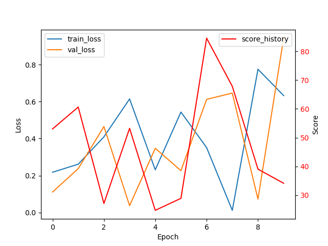
import matplotlib.pyplot as plt
import numpy as np

# 生成一些随机数据
train_loss = np.random.rand(10)
val_loss = np.random.rand(10)
score_history = np.random.rand(10) * 100

# 创建一个带有两个 y 轴的图形
fig, ax1 = plt.subplots()

# 在左侧 y 轴上绘制 train_loss 和 val_loss 的线图
ax1.plot(train_loss, label='train_loss')
ax1.plot(val_loss, label='val_loss')
ax1.set_xlabel('Epoch')  # x 轴标签
ax1.set_ylabel('Loss')  # 左侧 y 轴标签
ax1.tick_params(axis='y')  # 设置左侧 y 轴的刻度
ax1.legend()  # 绘制图例

# 创建一个右侧 y 轴
ax2 = ax1.twinx()

# 在右侧 y 轴上绘制 score_history 的线图
ax2.plot(score_history, color='red', label='score_history')
ax2.set_ylabel('Score')  # 右侧 y 轴标签
ax2.tick_params(axis='y', labelcolor='red')  # 设置右侧 y 轴的刻度和标签颜色
ax2.legend()  # 绘制图例

# 显示图形
plt.show()